A Brand Identity in Progress
Snap Kitchen has gone through several re-brands in its 10 years, and its identity was a bit mixed up across our channels. This is still a massive work-in-progress effort, as maintaining a brand always is. Below are some of the areas where I’ve made an impact thus far.
Refreshed Color Palette
-
Old.
The old palette focused heavily on both Kale & Plum, anchoring it in a winter color story. It also had a muted secondary palette. It wasn’t evoking the freshness and immediacy you want to find from fresh ingredients.

-
New.
Snap Kitchen’s original palette was designed by Pentagram. I took a cue from their expertise and went back to a fresher/vibrant palette. In order to avoid making this a full “re-brand” I kept nearly all of the primary colors, but relegated Plum to a sparingly used secondary color.

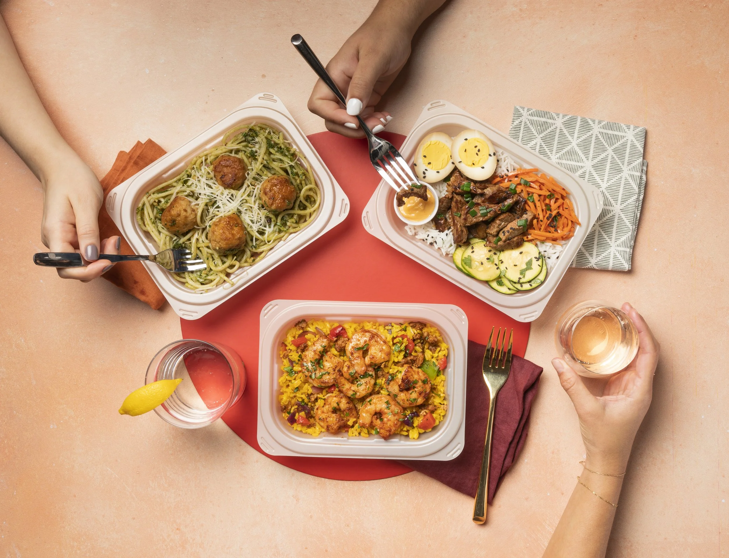
Irresistible photos that tell a story
Illustration Style
-
Old.
Single color. Illustrations of hambone, etc. aren’t exactly appealing. Lettering has a busy-ness to it.

-
New.
Note: Still a work-in-progress. However, the new style incorporates pops of color. Attempts to simplify and remove overly feminine flourishes.


